I decided to start totally over but keep the black and white theme. I used a different more modern and unique font for the title and definition. But i wanted the background image to be more interesting and eye grabbing. I used a deer picture and pen tooled the outline. I chose a deer because the antlers have a space in between them and i thought that, that space could be used to put the definition in. My critiques from the other one was to use a better more interesting font and to make the flow of words easier to read. I think I accomplished both of these things while also making the poster a lot more eye grabbing and interesting to look at.
0 Comments
 i really haven't started that much much i'm playing with only back and white and geometric shapes. I was trying to make black lines bleed into the word contrast but i think i need to use a tablet in Photoshop because lines in illustrator look bad.
 I cropped the image to make all the space for the text on one side and i made every and good the same size. my comments from the class were to not put words on the guy in the picture and make good and every the same size. i kept the same theme of the contrasting colors and the type. i just wish that the words weren't so close to the guy and that it had more space around him.
  i think that on my posters the words are easy to read and that the words flow well. i also think that they look harmonious and unified because i chose colors that were within the pictures. i like the second one better because i like how i fit the words on the picture and i like the contrast of the black and white ageist the contrasting picture. i feel like they are plain but i don't really know what else to add because i don't want it to look not thought about and too busy. im also in the process of creating one about spring with flowers and clipping masks.
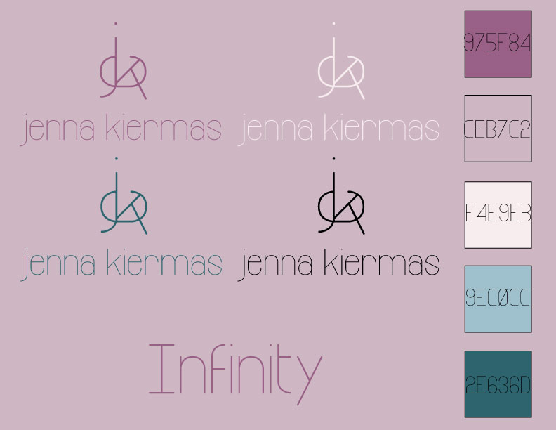
   For my identity project i started off by creating a bunch of logos with my initials in different fonts and on one of the last days i found my favorite font that has a uniqueness to it with a funky s and it happened that i didn't really need to change the letters that much to make them fit together. So i went with that font and i picked a cooler color palette that's easy to look at. for the back round i stuck with the theme of keeping it geometric. to make the pattern i took sideways e's and put them together then the blue lines are giant ks with lower opacity over the pattern. overall i'm pretty happy with the project and there's nothing that i feel like i still need to change or work on.
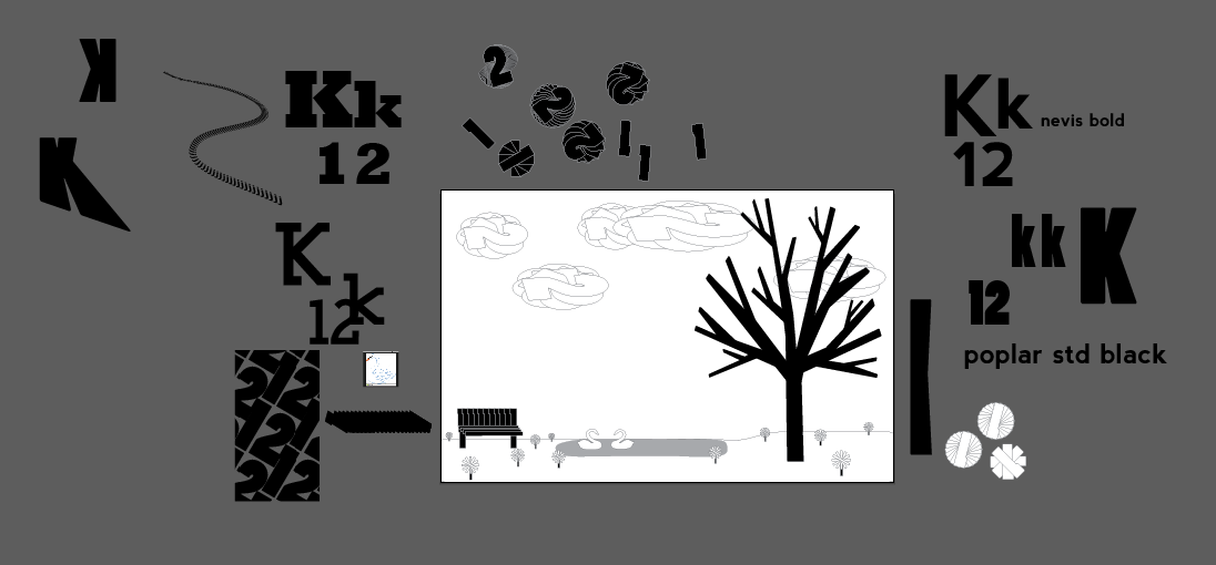
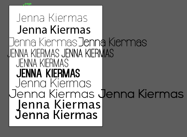 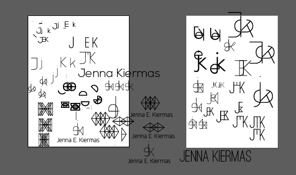 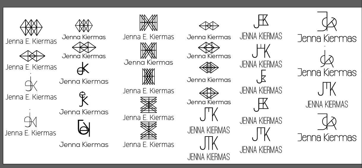 I first went through all the fonts i liked and played with my favorites to try to fit my initials together. i really liked the look of the modern fonts that were simple and thin which were also easy to form together to make a logo. i tried playing with triangles and diamonds but i wasn't really feeling it because it didn't feel unique to me. i eventually found my favorite font that's at the end of the all the examples above because i liked the look of the s and how clean it looked. then when i played with the font to fit them together i didn't have to make that many adjustments and they fit together pretty perfectly and i really liked the look it it. I just have to decide whether i like the lower case j or the upper case J. i was thinking for my color pallet to have some purples and blues and cooler colors.
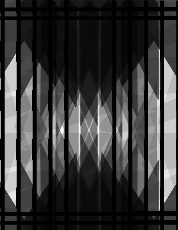
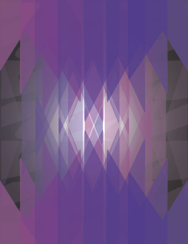
I like my design and but i like the grey scale version better because you can see the depth better and the contrast is better. From the class discussion they said i should stay away from the black and white and add i totally different color in the back and add the bars back in the color design. How i made my design was that i blew up the k and played a lot with the opacity of them then made a pattern with the twos.
The first three logos i submitted to the contest and the fourth one is the one I've revised. The changes I made were that i made the steering wheel thicker to make it look more proportional, I resized the middle shapes a little and the strokes of the texts to make it stand out more. The last thing I did was that I added little notches to add detail to the design. I'm really not sure if I like the notches or not I think it might look too busy and not as sleek as the first design. The only feedback I got was to make the steering wheel thicker and to make the curved text stand out more and I did that.
The first one is supposed to demonstrate boldness and it was my favorite because it was simple but very effective. The second one in my least favorite because I feel like its too busy but not interesting enough. I realized that I like more minimalist designs after making all of the designs and looking at others designs.
|